
Update · Site & Language
A tidier home screen
Fewer panels over the scenery: the flight board starts off, one latest update, and follow, share and coffee move to the foot of the menu.
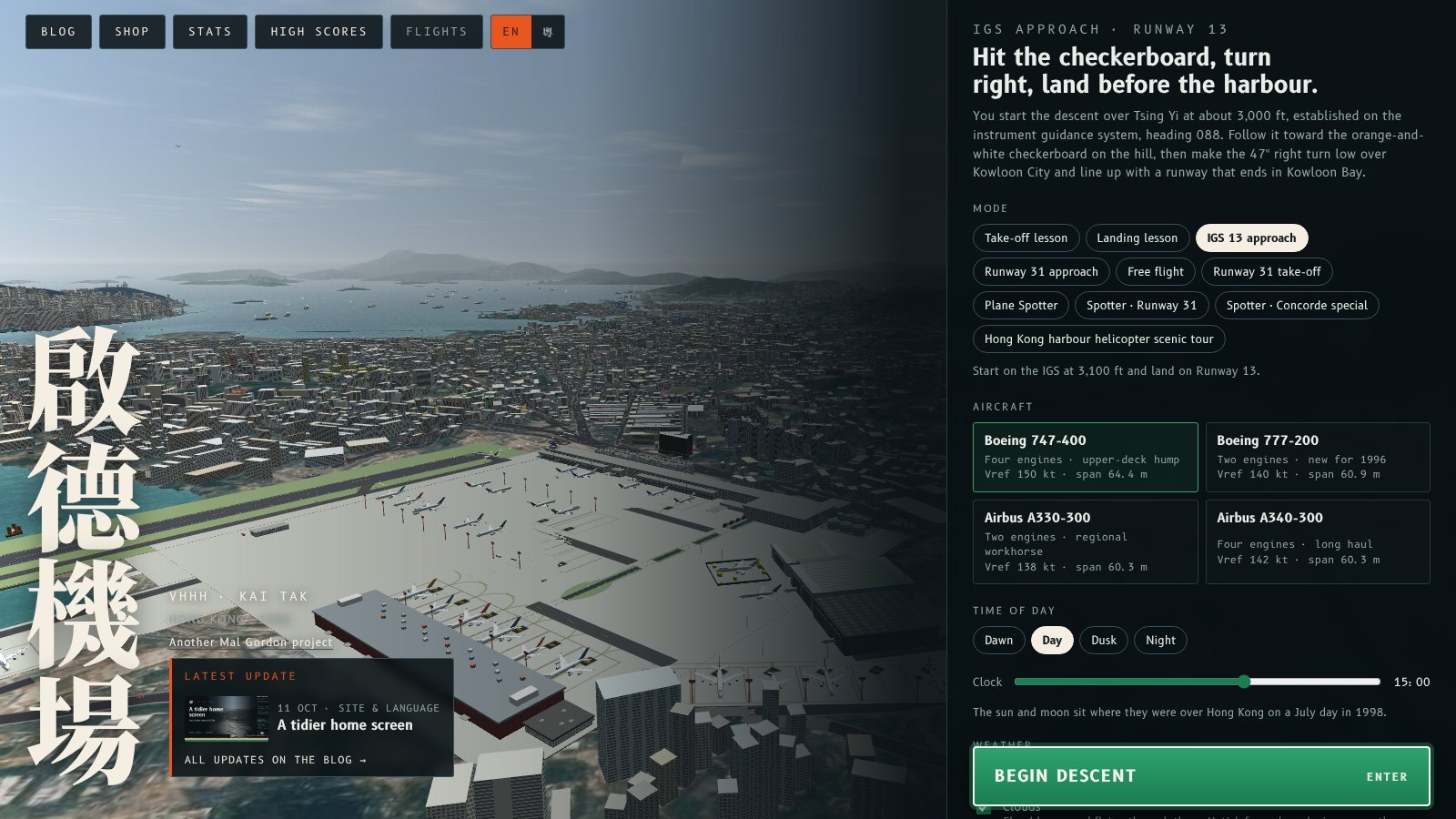
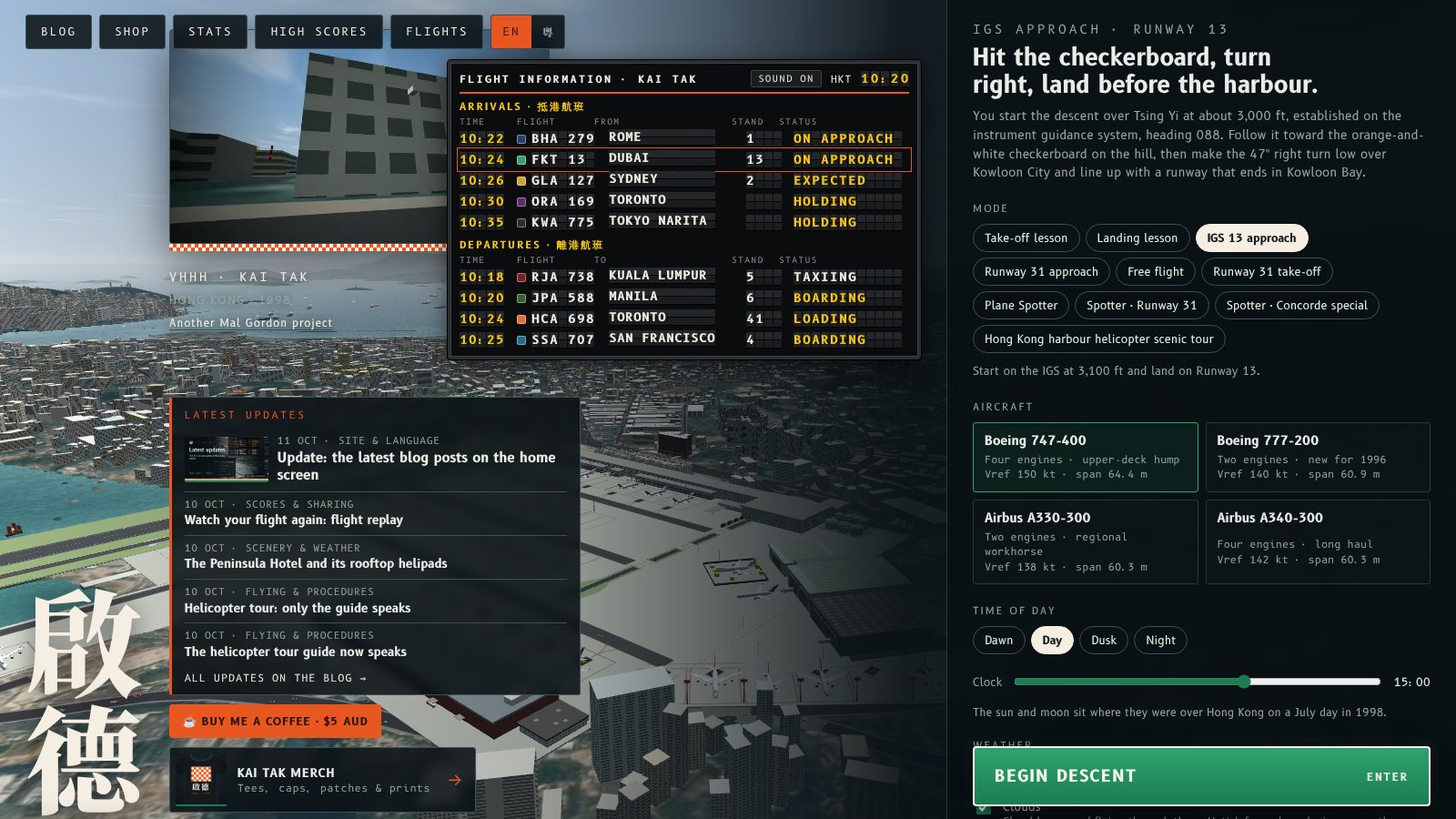
The home screen had grown a lot of extras over the past weeks: a demo reel, the flight information board, five blog posts, a merch card, a coffee button, follow links and seven share buttons, all stacked over the live view of Kai Tak. It is now trimmed back to what matters when you arrive: the name, the newest update, and the menu to pick a flight.
What changed
- Flight board off by default. The split-flap arrivals and departures board no longer opens on its own. Press B or the Flights button at the top to show it; your choice is remembered.
- One latest update. The panel now shows the newest blog post with its card image, plus All updates on the blog.
- No demo reel. The live sim already runs behind the menu, so the video inset went.
- Shop in the top bar only. The separate merch card is gone; Shop is still at the top.
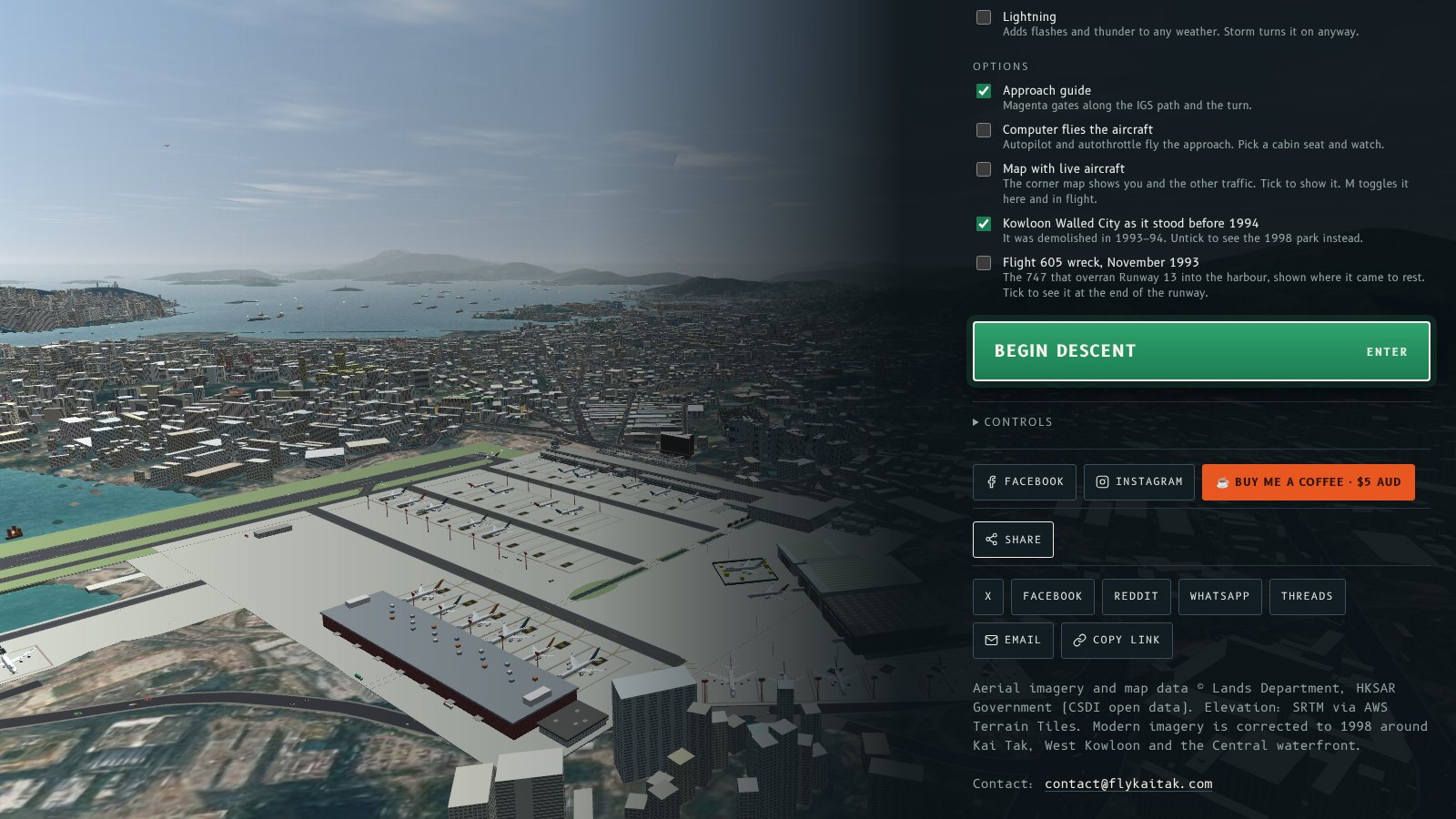
- Follow, share and coffee moved down. Facebook, Instagram, Buy me a coffee and a single Share button now sit at the bottom of the menu, under Controls. Share opens the full list: X, Facebook, Reddit, WhatsApp, Threads, email and copy link.
過去幾個禮拜,主畫面加咗好多嘢:示範片、航班資料板、五篇網誌、精品卡、請飲咖啡掣、追蹤連結同七個分享掣,全部疊喺啟德嘅即時畫面上面。而家精簡返,淨係留低一入嚟最重要嘅:名、最新消息,同揀航班嘅選單。
改咗啲乜
- 航班資料板預設關閉。翻牌式到港同離港資料板唔會自己彈出嚟。㩒 B 或者頂部嘅 Flights 掣就會顯示,會記住你嘅選擇。
- 只顯示最新一篇。面板而家只顯示最新一篇網誌同佢嘅卡片圖,加埋「網誌睇晒所有更新」。
- 冇咗示範片。選單後面本身已經行緊即時模擬,所以唔使再放片。
- 商店只喺頂部。獨立嘅精品卡拎走咗,頂部仲有 Shop。
- 追蹤、分享同咖啡搬咗落去。Facebook、Instagram、請飲咖啡同一個 Share 掣而家喺選單最底,Controls 下面。㩒 Share 會開晒所有選項:X、Facebook、Reddit、WhatsApp、Threads、電郵同複製連結。
More from the blog
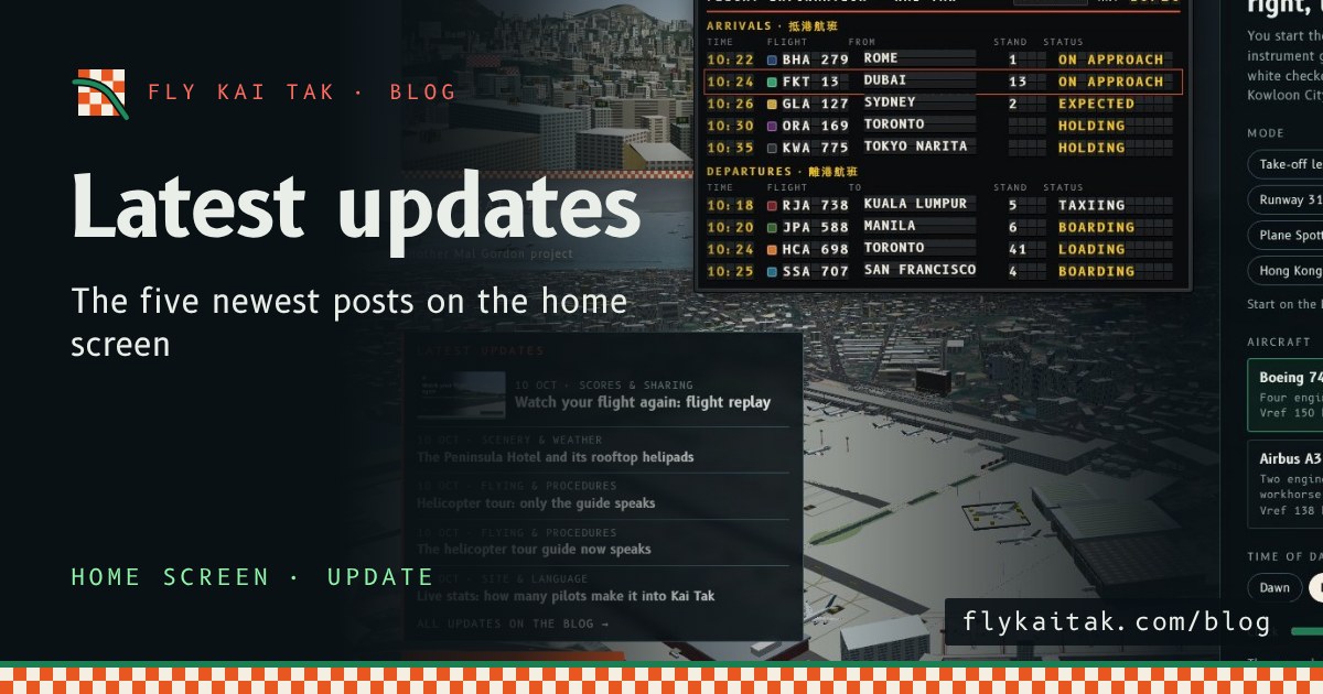
Update: the latest blog posts on the home screen
Fly Kai Tak update: the home screen now lists the titles of the five newest blog posts, with dates and categories, linking to each post.
Read the post →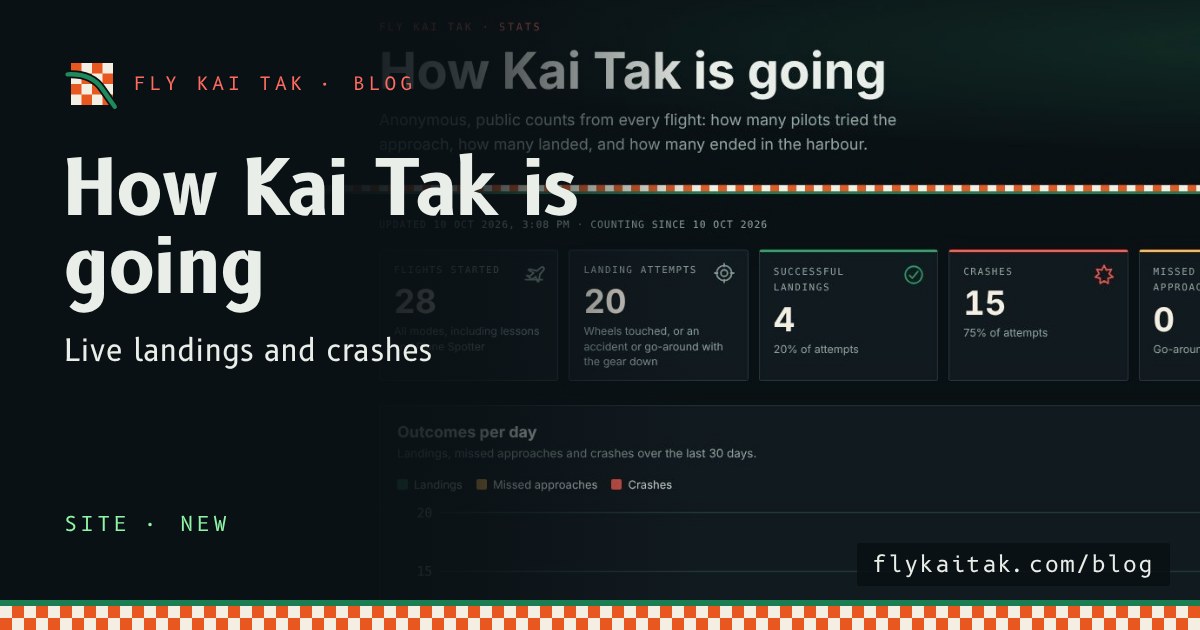
Live stats: how many pilots make it into Kai Tak
Fly Kai Tak's public stats page counts every flight: landing attempts, landings, crashes, modes, aircraft, weather and crash causes. Anonymous.
Read the post →